What started as an effort to start both and just see which one ended up in the ditch, ended up as two relatively easy projects on which I was able to put the finishing touches.
So I have two for this final week:
#1
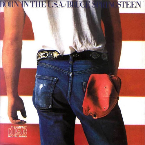
Bruce Springsteen -- Born in the U.S.A.
Now, before scrolling down to the original and my recreation, allow me to ask you two questions:
1.) Without looking -- does Springsteen's Born in the U.S.A. album cover feature the United States Flag? Yes or No?
--
I was certain that it did.
But it doesn't -- or at least maybe it doesn't.
It's just red and white stripes, which could be just about anything. No field of blue or stars can be seen. Maybe it's the flag, maybe it's not.
Second question:
2.) What's in the Boss's back pocket?
Can you picture it?
I always thought it was just a red rag. I always though it conveyed a working-class, everyman vibe. But upon closer inspection, it is not a rag at all. It is a ballcap.
That creates a completely different feel to the entire image, doesn't it? Much more youthful and playful, I think.
Anyway,
Here's the original:
And here's mine:
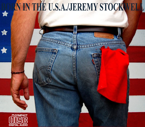
You will notice that I went with my original thoughts about the album cover and mine clearly features the unmistakable symbols of the flag of the United States and I also just used a rag in my pocket because I don't own a red ballcap.
Moving on...
#2
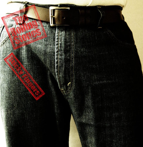
Rolling Stones -- Sticky Fingers
I guess I figured since I was featuring a rear shot homage...
I may as well do the flip side as well.
The album cover to Sticky Fingers was conceived by Andy Warhol and featured a working zipper on the outside of the record sleeve.
The photo was easy enough to take and the processing of the image itself wasn't too bad either. My only problem with the image processing was finding consistent color and title design from sample to sample. I ended up going with a piecing together of the two choosing my favorites of the samples that I found.
The thing I had the most fun with was recreating the style of the title design. The stone-washed looking lettering and border wasn't difficult to do, but I learned a few things about my photo editing program in order to accomplish the effect.
Here's one version of the original:

And here's mine:
That's all, folks. See you next month!


No comments:
Post a Comment